데이터를 효과적으로 분석하고 시각화하는 것은 매우 중요합니다. Streamlit은 Python을 활용하여 손쉽게 웹 애플리케이션을 구축할 수 있는 도구이며, 다양한 시각화 라이브러리와 함께 사용할 수 있습니다. 이번 글에서는 Seaborn(sb), Matplotlib(plt), Plotly를 Streamlit에서 활용하는 방법을 정리해보겠습니다.
1. Seaborn과 Matplotlib을 활용한 데이터 시각화
Seaborn과 Matplotlib은 정적인 데이터 시각화에 특화된 라이브러리입니다. Streamlit에서 이를 활용하는 방법을 알아보겠습니다.
한글폰트 깨짐방지
	#한글폰트 처리
    plt.rcParams['font.family'] = 'NanumGothic'
    plt.rcParams['axes.unicode_minus'] = False # 마이너스 기호 깨짐 방지
1.1 기본 환경 설정
import pandas as pd
import streamlit as st
import matplotlib.pyplot as plt
import seaborn as sb

def main():
    # 한글 폰트 설정 (Mac의 경우)
    plt.rcParams['font.family'] = 'AppleGothic'
    plt.rcParams['axes.unicode_minus'] = False  # 마이너스 기호 깨짐 방지

    st.title('Seaborn & Matplotlib 시각화')
    df = pd.read_csv('data/iris.csv')
    st.dataframe(df)
1.2 Matplotlib을 활용한 차트 그리기
산점도(Scatter Plot)

    st.subheader('스케터 플롯')
    fig1 = plt.figure()
    plt.scatter(data=df, x='petal_length', y='petal_width')
    plt.title('꽃잎 길이 vs 꽃잎 너비')
    plt.xlabel('꽃잎 길이')
    plt.ylabel('꽃잎 너비')
    st.pyplot(fig1)
히스토그램(Histogram)

    st.subheader('히스토그램')
    fig2 = plt.figure()
    plt.hist(data=df, x='petal_length', rwidth=0.8, bins=20)
    st.pyplot(fig2)
두개 차트를 한 화면에 그리기

st.text('두개 차트를 한 화면에 그리기')
    fig5=plt.figure(figsize=(10,5))
    plt.subplot(1,2,1) #1행 2열의 1번째
    plt.hist(data=df,x='petal_length',rwidth=0.8) #빈즈 디폴트 10개

    plt.subplot(1,2,2) #1행 2열의 2번째
    plt.hist(data=df,x='petal_length',rwidth=0.8,bins=20) #빈즈 20개
    st.pyplot(fig5)
1.3 Seaborn을 활용한 차트 그리기
회귀선이 포함된 산점도(Scatter Plot with Regression Line)

    st.subheader('회귀선이 있는 스케터 플롯')
    fig3 = plt.figure()
    sb.regplot(data=df, x='petal_length', y='petal_width')
    st.pyplot(fig3)
히트맵(Heatmap) 활용한 상관관계 분석

    st.subheader('히트맵')
    fig4 = plt.figure()
    sb.heatmap(data=df.corr(numeric_only=True), annot=True, cmap='coolwarm', vmin=-1, vmax=1)
    st.pyplot(fig4)
데이터 프레임 차트 그리기
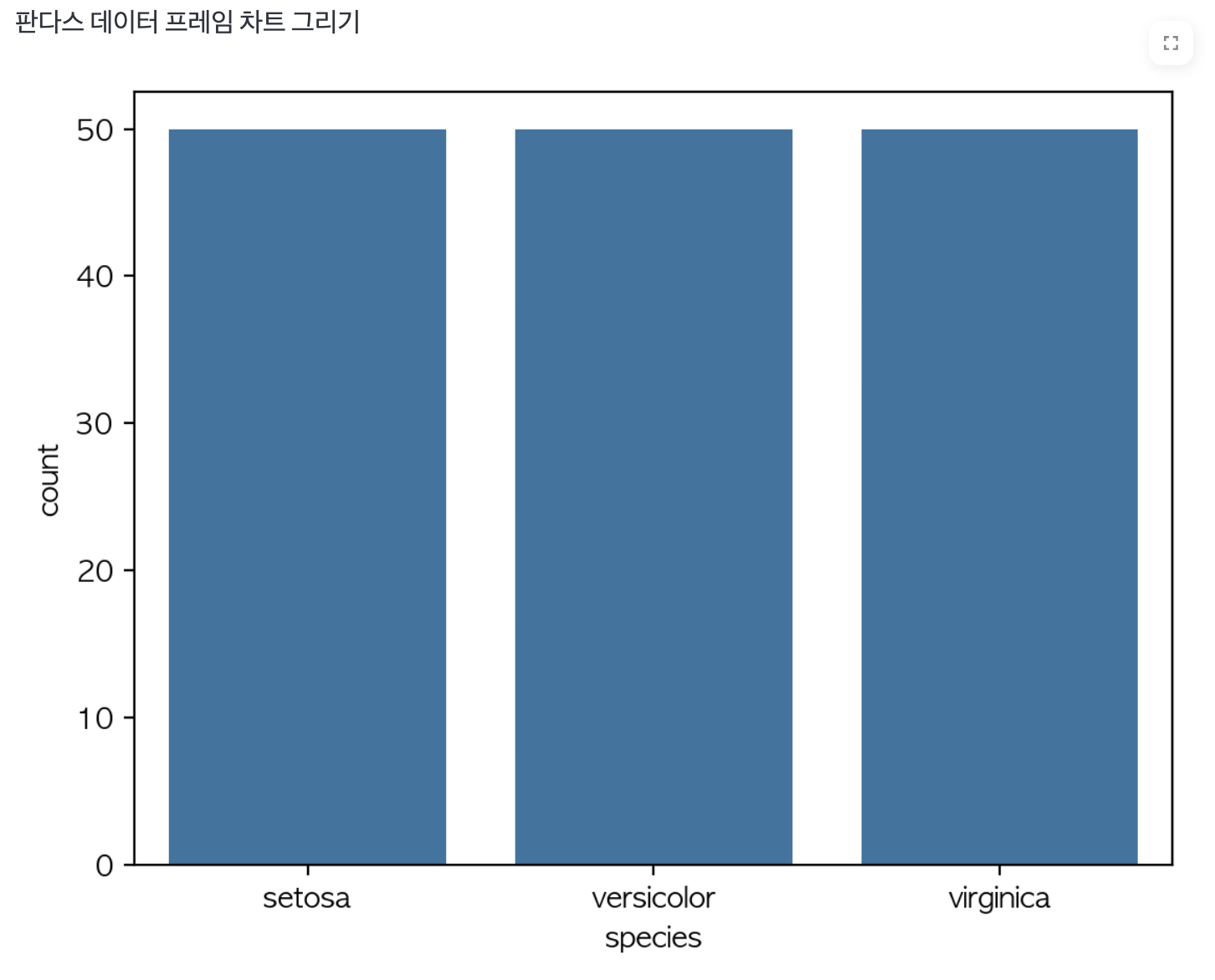
    st.text('판다스 데이터 프레임 차트 그리기')
    #species 컬럼의 데이터는 각각 몇개씩 있나?
    fig6=plt.figure()
    sb.countplot(data=df,x='species')
    st.pyplot(fig6)
2. Plotly를 활용한 동적 데이터 시각화
Plotly
Plotly's
plotly.com
Plotly는 대화형 차트를 만들 때 유용한 라이브러리입니다.
Streamlit에서 Plotly를 활용하여 웹 기반 대화형 차트를 구현하는 방법을 살펴보겠습니다.
우선 라이브러리 설치가 필요합니다.
$ conda install -c plotly plotly
2.1 데이터 불러오기 및 기본 설정
import plotly.express as px

def main():
    df = pd.read_csv('data/lang_data.csv')
    st.title('Plotly 시각화')
2.2 동적 라인 차트(Line Chart)

    st.title('언어별 인기도')
    selected_columns=st.multiselect('언어 선택',df.columns)
    if len(selected_columns) != 0:
        df_selected=df[selected_columns]

        #st의 내장 라인차트
        st.subheader('라인차트')
        st.line_chart(df_selected)

        #st의 내장 area차트
        st.subheader('area차트')
        st.area_chart(df_selected)
2.3 지도 시각화(Map Visualization)
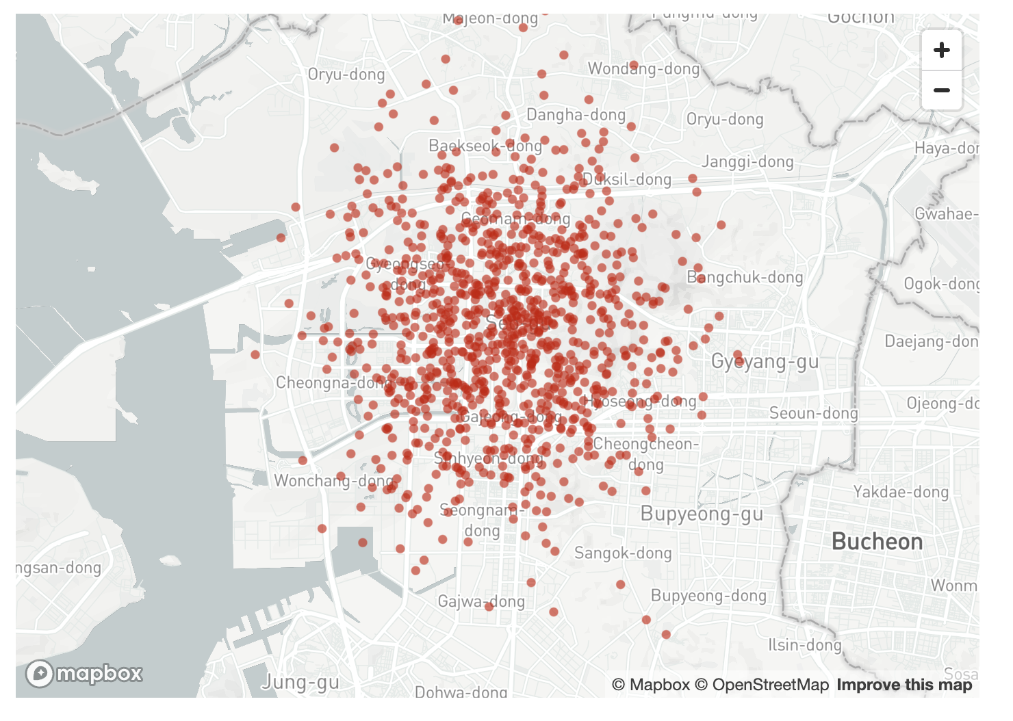
    st.title('위도 경도')
    df2=pd.read_csv('data/location.csv', index_col=0)
    st.dataframe(df2)
    #st내장 지도 그리는 함수
    st.map(df2)
2.4 파이 차트(Pie Chart) & 바 차트(Bar Chart)
파이 차트

    st.title('개발 언어별 사용량')
    df3=pd.read_csv('data/prog_languages_data.csv',index_col=0)
    st.dataframe(df3)
    #plotly express 파이차트로 나타내기
    st.subheader('파이차트')
    fig1=px.pie(data_frame=df3,names='lang',values='Sum',title='언어별 사용량')
    #names는 라벨, values는 값, title은 제목
    st.plotly_chart(fig1)
바 차트

    st.subheader('바차트')
    df4=df3.sort_values(by='Sum',ascending=False)
    fig2=px.bar(data_frame=df4,x='lang',y='Sum',title='언어별 사용량')
    st.plotly_chart(fig2)
3. 결론
이번 글에서는 Streamlit을 활용하여 Seaborn, Matplotlib, Plotly를 사용해 웹 기반 시각화를 수행하는 방법을 살펴보았습니다.
- Matplotlib과 Seaborn은 정적인 차트를 그릴 때 적합하며, st.pyplot()을 사용하여 Streamlit에 출력할 수 있습니다.
- Plotly는 대화형 차트를 만들 때 강력하며, st.plotly_chart()를 활용하여 손쉽게 웹 애플리케이션에 적용할 수 있습니다.
앞으로 Streamlit을 활용하여 더욱 다양한 데이터 시각화 기법을 적용해보세요!


